Prompt v1 · Precise · 1,183 words
Vectrus hero section: misty mountain landing
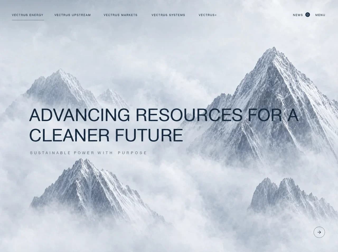
A full-viewport hero for a sustainable energy company called Vectrus. It pairs a pale, airy photograph of snow-capped peaks rising through clouds with a minimal uppercase top navigation, a large light-weight headline, a widely tracked tagline, and a small circular arrow button. The look is calm, corporate, and premium, in cool blue-grays. Rebuild it faithfully as a working, responsive page.
Layout
- Hero container: full width,
min-height: 100vh(the reference is 1280×956). The background photo is set toobject-fit: cover, centered. All content sits above it. - Top nav bar: absolutely positioned at the top.
- Horizontal padding is 45px and the text baseline sits about 56px from the top. The bar is roughly 112px tall.
- The left group holds 5 links in a single row. Approximate x-positions at 1280px are 45, 206, 393, 574 and 752, which works out to a gap of about 40–50px between items.
- The right group sits flush right at 48px from the edge. It contains "NEWS", a 16px circular icon, then "MENU". There is about 10px between "NEWS" and the icon, and about 28px between the icon and "MENU".
- Headline block:
- Left edge at about 110px (roughly 8.5vw). The top of the headline sits at about 42% of the viewport height, so the block is vertically centered slightly above middle.
- The headline runs two lines with a max width of about 1040px. Line 1 is "ADVANCING RESOURCES FOR A" and line 2 is "CLEANER FUTURE".
- The tagline sits 28px below the headline, aligned to the same left edge. It starts about 4px further right than the headline.
- Next button: a 42px circle, absolutely positioned 50px from the right edge and 54px from the bottom.
- Tablet (768–1023px):
- The left nav links collapse and are hidden. Keep the "NEWS" icon and "MENU" on the right, and put a "VECTRUS" wordmark on the left.
- Headline at about 52px, with left padding of 48px.
- Mobile (<768px):
- Nav shows "VECTRUS ENERGY" on the left and "MENU" on the right.
- Headline at 34–40px with 24px side padding, allowed to wrap naturally.
- Tagline at 11px with 0.3em tracking.
- Arrow button 24px from the right and bottom edges.
Visual style
- Colors
--ink#14233A: headline, nav text, icon fill.--ink-muted#5B6676: tagline.--line#14233A: active nav underline and arrow button border.--sky#E6EAEF: fallback background behind the photo.--mist#F2F4F7: brightest cloud tone.--rock#7C8799: mid-tone of the mountain shadows.
- Typography
- Font: "Inter Tight", falling back to Inter, "Helvetica Neue", Arial, sans-serif. Helvetica Now is the closest match to the reference.
- Nav links: 12px, weight 400, letter-spacing 0.12em, uppercase, line-height 1.
- Headline:
clamp(34px, 5.8vw, 76px), weight 400, line-height 1.06, letter-spacing -0.01em, uppercase, color #14233A. - Tagline: 14px, weight 400, letter-spacing 0.42em, uppercase, color #5B6676. There is a slightly wider gap before "PURPOSE" in the reference, which you can ignore.
- Effects
- Active nav underline: 1px solid #14233A, sitting 18px below the text and spanning the full link width.
- Arrow button: 1px solid #14233A border,
border-radius: 9999px, transparent fill. - Photo overlay: a very subtle white radial overlay behind the headline for legibility,
radial-gradient(ellipse at 35% 50%, rgba(255,255,255,0.25), transparent 60%). - No shadows.
Content
- Nav left: "VECTRUS ENERGY" (active), "VECTRUS UPSTREAM", "VECTRUS MARKETS", "VECTRUS SYSTEMS", "VECTRUS+"
- Nav right: "NEWS", "MENU"
- Headline: "ADVANCING RESOURCES FOR A CLEANER FUTURE"
- Tagline: "SUSTAINABLE POWER WITH PURPOSE"
Components
- NavLink:
- Uppercase text link.
- The active link has a 1px underline, placed 18px below the text.
- Inactive links show no underline. On hover, draw the underline in from left to right.
- News indicator:
- A 16px filled circle in #14233A.
- Inside it is a 7px ring (1.5px stroke, #E6EAEF), reading as a small "live/record" dot.
- It sits directly after "NEWS". The whole "NEWS" + icon unit is a single link.
- Menu button: a
<button>with the text "MENU". Clicking it opens a full-screen overlay menu, described in the interactions section. - Headline: a single
<h1>. Use a<br>after "FOR A" at widths ≥1024px only. - Tagline: a
<p>. - Next button:
- A 42px circular
<button>witharia-label="Next". - Contains a Lucide
ArrowRighticon at 16px, stroke 1.5, color #14233A.
- A 42px circular
Images and graphics
- Background photo: a full-bleed image slot. Image-generation prompt:
> "Ultra-wide photograph of jagged snow-covered granite mountain peaks piercing a thick sea of white clouds. One large pyramidal peak on the right-center, a smaller twin peak upper left, a sharp peak lower left, a double peak lower right, all separated by soft drifting fog. Pale, cool, high-key palette of whites and blue-grays (#F2F4F7, #D9DEE6, #7C8799, #4A5568). Soft diffuse overcast light, crisp rock and snow texture, airy, serene, minimal, premium corporate aesthetic. 16:10, lots of negative space in the center-left for text."
- Icons: use Lucide
ArrowRightfor the next button. Build the News dot as inline SVG, a filled circle with an inner ring. - There is no logo in the frame.
Interactions and states
- Nav links
- Hover: an underline
::afterscales fromscaleX(0)toscaleX(1), withtransform-origin: left, over 300mscubic-bezier(.2,.7,.2,1). - Click: sets that link as active, using local state.
- Hover: an underline
- Focus: show a visible focus ring on all controls,
outline: 1px solid #14233A; outline-offset: 4px. - News:
- Hover: the icon rotates 90deg over 300ms.
- Click: navigate to
#news.
- Menu:
- Clicking opens a full-screen overlay with background #E6EAEF at 96% opacity plus
backdrop-filter: blur(12px). - The overlay lists the 5 nav links vertically at 40px, and "MENU" becomes "CLOSE".
- The overlay fades in with opacity over 250ms. Links rise from
translateY(12px), staggered 40ms apart. - Pressing Escape closes it, and focus is trapped inside while it is open.
- Clicking opens a full-screen overlay with background #E6EAEF at 96% opacity plus
- Next button
- Hover: fill becomes #14233A and the arrow turns white, over 200ms. The arrow nudges
translateX(3px). - Active:
scale(0.95). - Click: smooth-scrolls to the next section (
#next) or advances a hero slide index. Keep an array of 3 mock slides with different headlines, and cross-fade between them with opacity over 600ms.
- Hover: fill becomes #14233A and the arrow turns white, over 200ms. The arrow nudges
- Load animation
- The background scales from 1.06 to 1 over 1.6s ease-out.
- The headline lines fade and rise from
translateY(20px)over 800ms, staggered 120ms. - The tagline follows at a 400ms delay.
- Reduced motion: under
prefers-reduced-motion, disable scaling and translation and use opacity changes only, at 150ms or less.
Build notes
- Use the builder's default stack, or React with Tailwind CSS if there is no preference.
- Split the code into reusable components:
Hero,TopNav,NavLink,NewsIndicator,MenuOverlay, andIconButton. - Use semantic HTML:
<header><nav>for the nav, then<main><section>for the hero. - All controls must be keyboard accessible with visible focus states.
- Text must keep at least 4.5:1 contrast against the pale photo. Use the radial overlay if needed.
- For 60fps motion, animate only
transformandopacity. Never animate width, height, top, left, or box-shadow.