Prompt v1 · Precise · 1,474 words
Anchor AI insurance operations hero
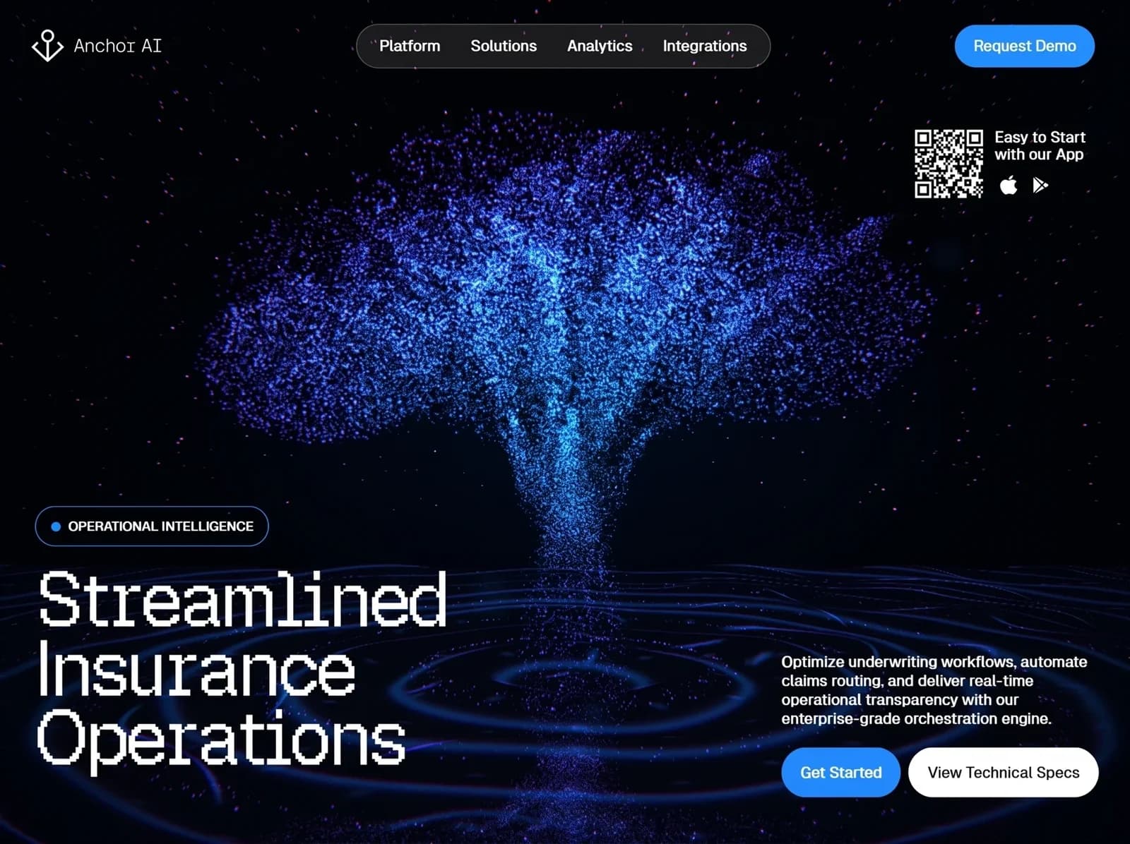
A full-viewport dark hero section for "Anchor AI," an insurance operations platform. The background is near-black with a glowing blue-violet particle tree rising out of rippling, luminous water, framed by a starfield. A crisp pixel-style display headline sits bottom left and a bright blue CTA system sits bottom right. Rebuild it faithfully as a working, responsive interface.
Layout
- Section: full width,
min-height: 100vh, reference frame about 1600×1196. The background image covers the whole section. Content sits in a padded frame: 44–56px side padding on desktop, 36px top padding. - Header row (top, about 60px tall, vertically centered at y≈64):
- Left: the logo (anchor icon plus wordmark) at x≈44.
- Center: a pill-shaped nav, absolutely centered horizontally. It is about 586×62px, runs from x≈505 to 1090, and holds 4 links with about 43px gaps.
- Right: the "Request Demo" pill button, about 198×60px, right-aligned at x≈1550.
- App download block: top right, about 120px below the header (top ≈182px), right-aligned with the header button. It is a row of a 96×96px QR code, an 18px gap, then a text column holding a 2-line label with 2 store icons below it.
- Central area: empty so the tree artwork shows through. The tree trunk is centered at about 50% x, and the canopy spans roughly x 280–1320 and y 150–650.
- Bottom left:
- A badge pill at about y≈717, 330×56px, left at x≈50.
- 24px below it, a 3-line headline stacked at x≈52. Each line is about 97px tall and the block ends near y≈1090.
- Bottom right:
- A paragraph block starting at x≈1106, max-width about 440px, top ≈925.
- 28px below it, a row of 2 buttons with a 12px gap: "Get Started" (≈168×70) and "View Technical Specs" (≈270×70).
- The bottom of the button row aligns about 64px above the section bottom, level with the headline's last line.
- Tablet (≤1024px):
- Hide the center nav and replace it with a hamburger button that opens a dark panel listing the 4 links. Keep "Request Demo."
- Headline scales to about 72px.
- Bottom-right content stacks below the headline, left-aligned, max-width 520px.
- The QR block stays top right but shrinks to 80px.
- Mobile (≤640px):
- Header shows the logo and the hamburger only. "Request Demo" moves into the menu panel.
- Hide the QR block and show only the 2 store icon buttons under the CTAs.
- Headline is about 48px. Buttons go full width, stacked with 12px gaps.
- Background image is centered on the tree trunk.
Visual style
- Colors:
--bg#02030A: page background.--bg-2#070A1A: deep navy used in the vignette.--text#FFFFFF: all primary text.--text-muted#D9DEEA: paragraph text, used at about 95% opacity.--accent#2A8BF5: primary buttons and the badge dot.--accent-hover#4A9EFF--accent-press#1C72D6--nav-bgrgba(10,12,20,0.72): nav pill fill.--nav-borderrgba(255,255,255,0.28): nav pill border.--badge-border#3552C8: dark blue badge outline.--badge-bgrgba(6,10,30,0.55)- Particle and glow tones: #3E6BFF (royal blue), #37A6FF (cyan core), #6A4BF0 (violet), #9B6BFF (lilac sparks).
- Typography:
- Headline: closest Google Font is "Pixelify Sans" (fallback "Departure Mono", "Silkscreen", monospace), weight 400. Aim for a crisp bitmap-grotesk look with stair-stepped curves, set in mixed case. Size is about 96px desktop (
clamp(48px, 7.5vw, 104px)), line-height 1.0, letter-spacing -0.02em, color #FFFFFF. - Logo wordmark: "Anchor AI" in "Pixelify Sans" or "Space Mono" (fallback monospace), 26px, weight 400, letter-spacing 0.02em.
- UI and body: "Inter" (fallback system-ui, sans-serif).
- Nav links: 21px, weight 500, letter-spacing -0.01em.
- Buttons: 21px, weight 500.
- Badge: 17px, weight 600, uppercase, letter-spacing 0.01em.
- Paragraph: 20px, weight 500, line-height 1.35, letter-spacing -0.01em.
- App label: 20px, weight 500, line-height 1.2.
- Headline: closest Google Font is "Pixelify Sans" (fallback "Departure Mono", "Silkscreen", monospace), weight 400. Aim for a crisp bitmap-grotesk look with stair-stepped curves, set in mixed case. Size is about 96px desktop (
- Radii and borders:
- All pills (nav, buttons, badge) use a 9999px radius.
- Nav border is 1.5px
--nav-border. Badge border is 1.5px--badge-border. Buttons have no border.
- Effects:
- Nav pill uses
backdrop-filter: blur(12px). - A soft radial vignette darkens the edges:
radial-gradient(ellipse at 50% 55%, transparent 40%, rgba(2,3,10,0.85) 100%). - Add a bottom-left gradient
linear-gradient(to top right, rgba(2,3,10,0.6), transparent 50%)to keep the headline legible. - Primary buttons get a faint glow:
box-shadow: 0 8px 30px rgba(42,139,245,0.35)(static, not animated).
- Nav pill uses
Content
- Logo: "Anchor AI"
- Nav: "Platform", "Solutions", "Analytics", "Integrations"
- Header button: "Request Demo"
- App block: "Easy to Start" / "with our App"
- Badge: "OPERATIONAL INTELLIGENCE"
- Headline: "Streamlined" / "Insurance" / "Operations"
- Paragraph: "Optimize underwriting workflows, automate claims routing, and deliver real-time operational transparency with our enterprise-grade orchestration engine."
- Buttons: "Get Started", "View Technical Specs"
Components
- Logo: a white line anchor icon, about 46px tall with a 2px stroke. It has a ring at the top, a crossbar, a vertical shank, and curved flukes ending in arrow tips. Place the wordmark 14px to the right. The logo links to "/".
- Nav pill: 4 text links in white, with 32px horizontal padding inside the pill. There is no active indicator visible.
- Request Demo:
--accentbackground, white text, padding 0 28px, height 60px. - App block:
- A 96px QR code in white modules on the transparent dark background. Use a real generated QR (for example
qrcode.react, fgColor #FFFFFF, bgColor transparent) that encodes the app URL. - Label in white.
- Below the label, 12px down, 2 icons at 28px in white with a 20px gap: an Apple logo and a Google Play triangle. Each is a link with an aria-label ("Download on the App Store" and "Get it on Google Play").
- A 96px QR code in white modules on the transparent dark background. Use a real generated QR (for example
- Badge: inline-flex, padding 0 22px, height 56px, with a 12px gap between a 12px round
--accentdot and the uppercase label. - Headline: an
h1with each word on its own line. - Paragraph: a white
p, max-width 440px. - Get Started:
--accentfill, white text, height 70px, padding 0 28px. - View Technical Specs: white #FFFFFF fill, #0A0A0F text, height 70px, padding 0 28px.
Images and graphics
- Hero background: use an image slot (
/hero-tree.jpg,object-fit: cover,object-position: 50% 40%). Generate it with this prompt: "A majestic tree made entirely of millions of tiny glowing particles, electric blue and cyan at the trunk core fading to royal blue and violet at the canopy edges. It has a broad umbrella-shaped canopy and rises from a dark reflective water surface with concentric glowing blue ripple rings spreading outward. Particles cascade down the trunk like a waterfall into the water. Deep black space background with a sparse starfield of tiny pink and violet specks. Cinematic, high contrast, digital data-visualization aesthetic, centered composition, 16:10." - Particle overlay: add a lightweight
<canvas>over the image with about 120 tiny drifting star particles (1–2px, colors #9B6BFF, #6A4BF0, #3E6BFF, opacity 0.3–0.8). - Icons:
- Anchor: a custom SVG, or Lucide
Anchorat stroke 1.75. - Apple and Google Play: Simple Icons (
siApple,siGoogleplay), in white. - Hamburger: Lucide
Menu/X.
- Anchor: a custom SVG, or Lucide
Interactions and states
- Nav links: on hover, text turns #7FB8FF over 150ms and a subtle pill highlight
rgba(255,255,255,0.08)fades in via opacity. Links scroll to anchors (#platform, #solutions, #analytics, #integrations). - Primary buttons: hover changes the background to
--accent-hoverand appliestransform: translateY(-1px). Active uses--accent-pressandscale(0.98). Transitions are 180ms ease-out.- "Request Demo" and "Get Started" open a modal demo form (name, work email, company, and a submit button). It validates locally and shows a success state reading "Thanks — we'll be in touch."
- View Technical Specs: hover changes the background to #E6ECF5 and scrolls to #specs.
- Focus: a visible 2px #7FB8FF outline with 3px offset on all interactive elements.
- Disabled: 50% opacity with
cursor: not-allowed, used for the form submit while it is sending. - Mobile menu: slides down with opacity plus translateY(-8px→0) over 220ms using
cubic-bezier(.2,.8,.2,1). Close it with Esc or a click outside. Trap focus while it is open. - Motion:
- On load, the badge, headline lines, paragraph and buttons fade up (opacity 0→1, translateY 16px→0) over 600ms ease-out, staggered 80ms apart.
- The background slowly scales from 1.0 to 1.04 over 20s, alternating infinitely.
- Canvas stars drift and twinkle.
- Reduced motion: under
prefers-reduced-motion, disable the zoom, canvas drift and stagger, and show content immediately.
Build notes
- Use the builder's default stack (React with Tailwind CSS if it has no preference).
- Split the build into reusable components:
Header,NavPill,PillButton(primary and light variants),Badge,AppDownload,HeroBackground,DemoModal. - Use semantic markup:
header,nav,main > section,h1. - Ensure keyboard access throughout, visible focus, and at least AA contrast; the overlays guarantee text legibility.
- Animate only transform and opacity. Never animate width, height, top, left, or box-shadow.
- Keep the canvas at 60fps with
requestAnimationFrameand devicePixelRatio scaling, and pause it when the tab is hidden.